3 World trade center
3 World trade center
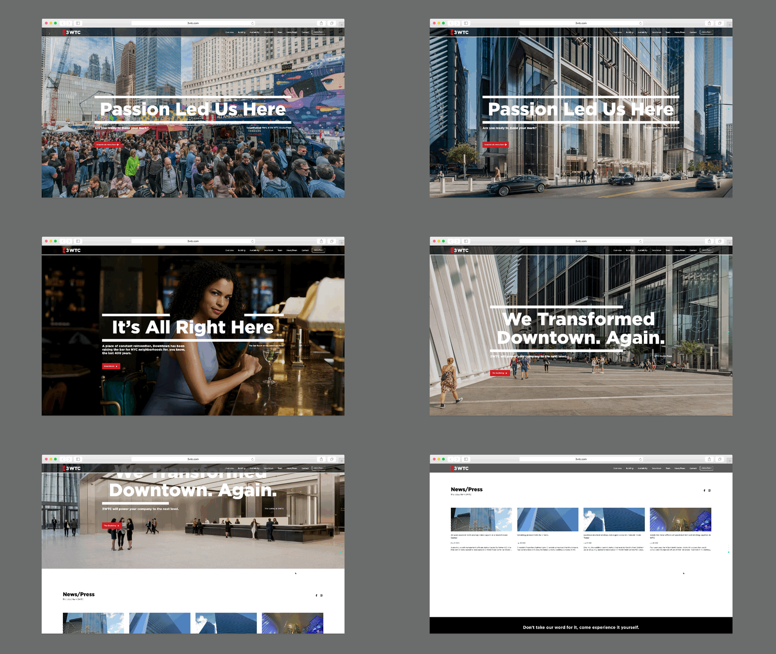
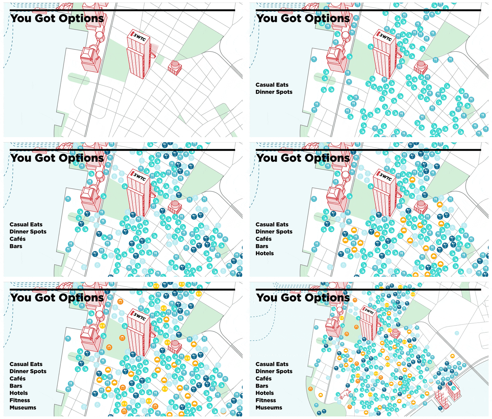
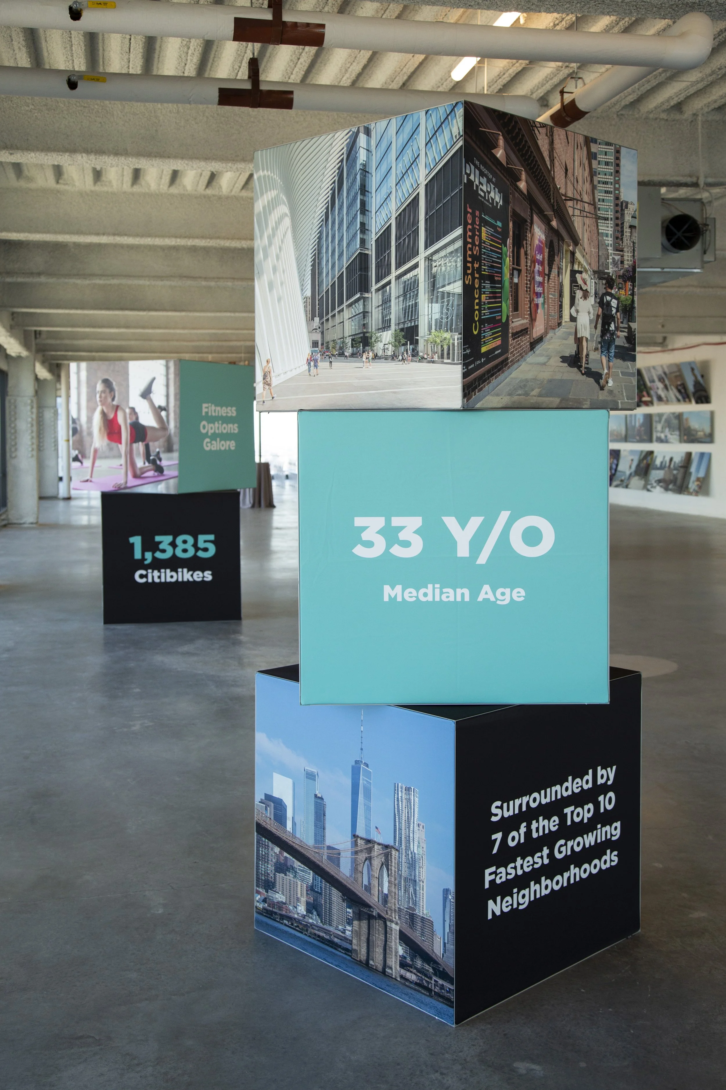
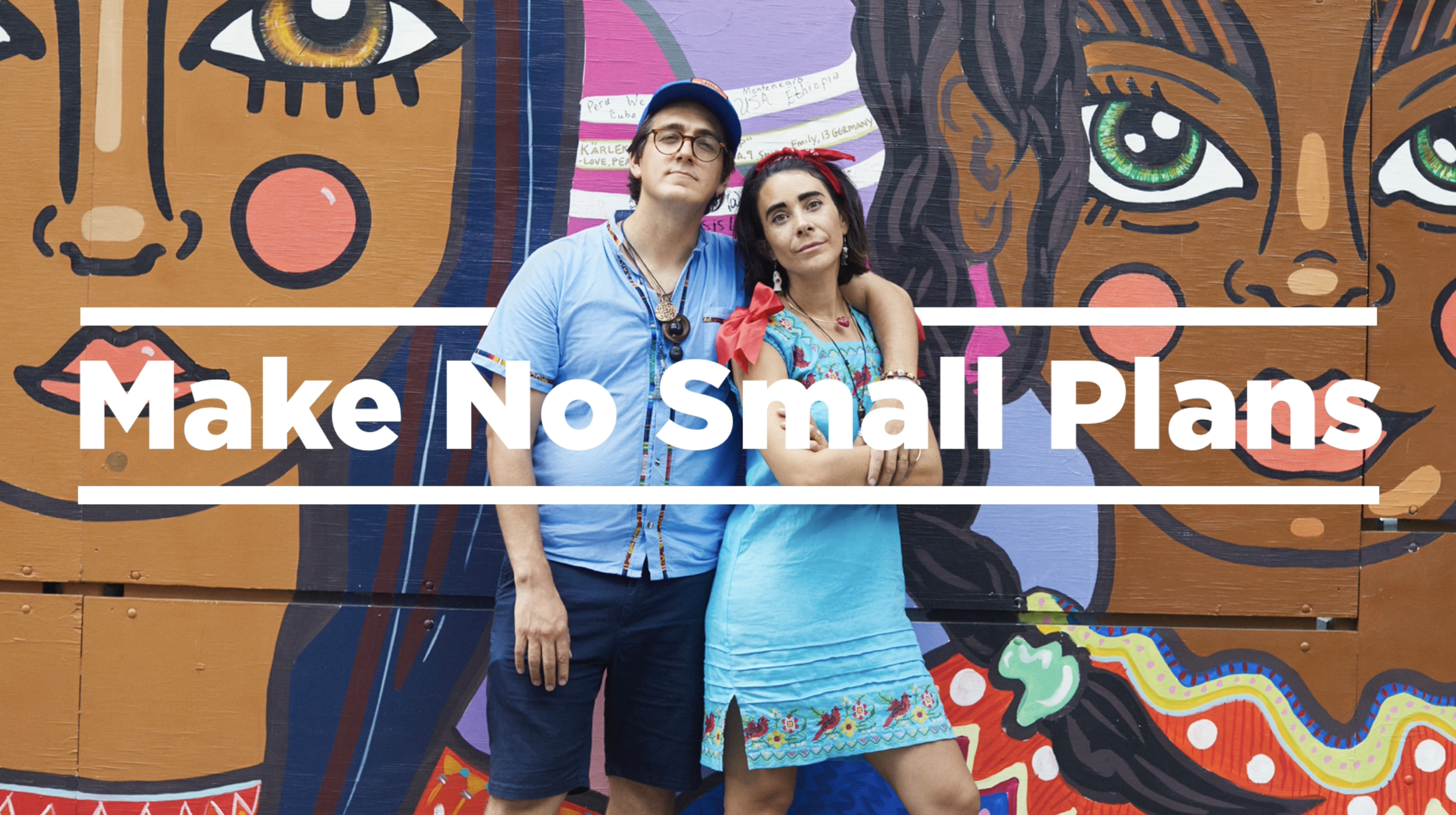
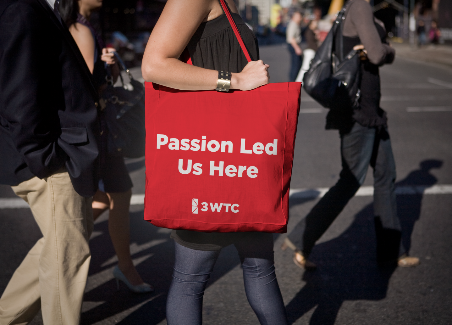
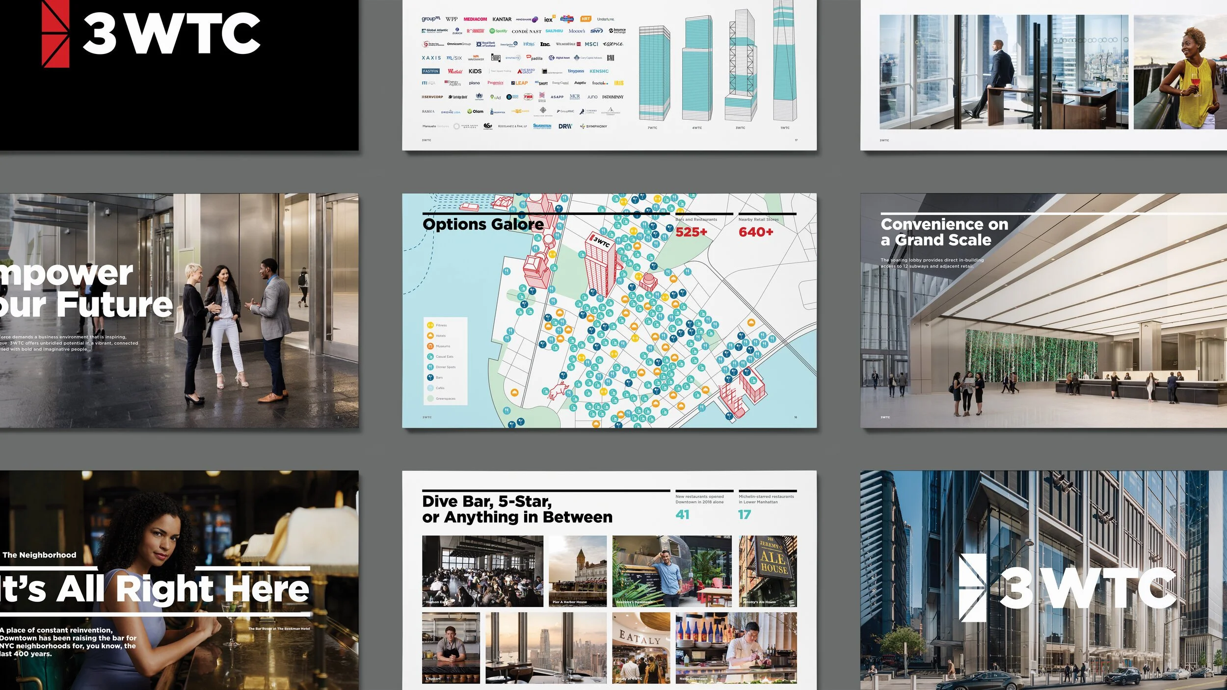
brief: Create an identity for a building that resembled the future of a widely misunderstood downtown manhattan. We looked to develop a three-part platform that addressed shifts in the workplace and workplace culture, alongside the spectrum of passionate individuals that have come to define the Trade Center and greater downtown community
team: Creative Director, Brand Art Director, Mid-level designer, Project Manager, Photographer, Photo Editor, UI/UX Designer, Web Developer
Client | Completed at: Silverstein Properties | Neoscape
Downtown means business
-

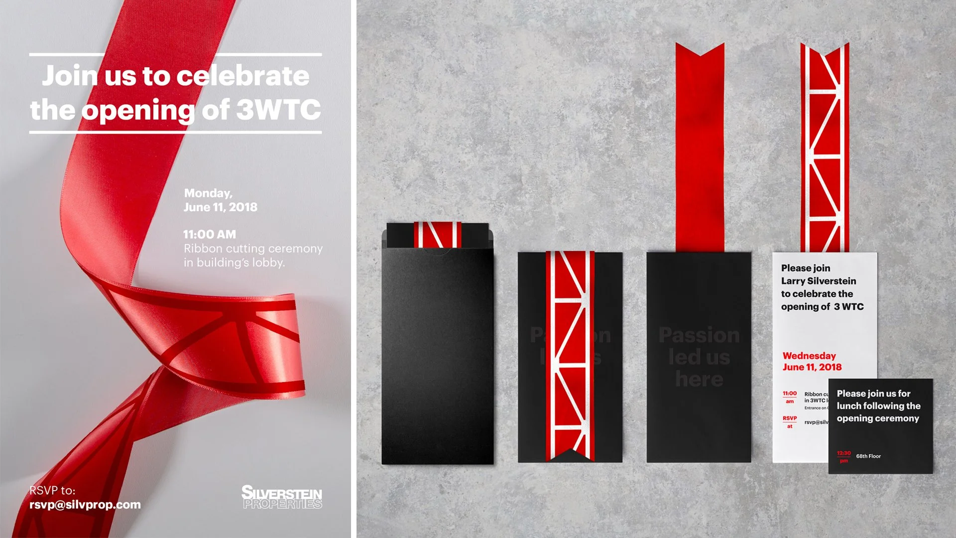
The logo was inspired by the instantly recognizable “K” brace from the architecture of the building, designed by Rogers Stirk Harbour + Partners
-
-
-

-

-

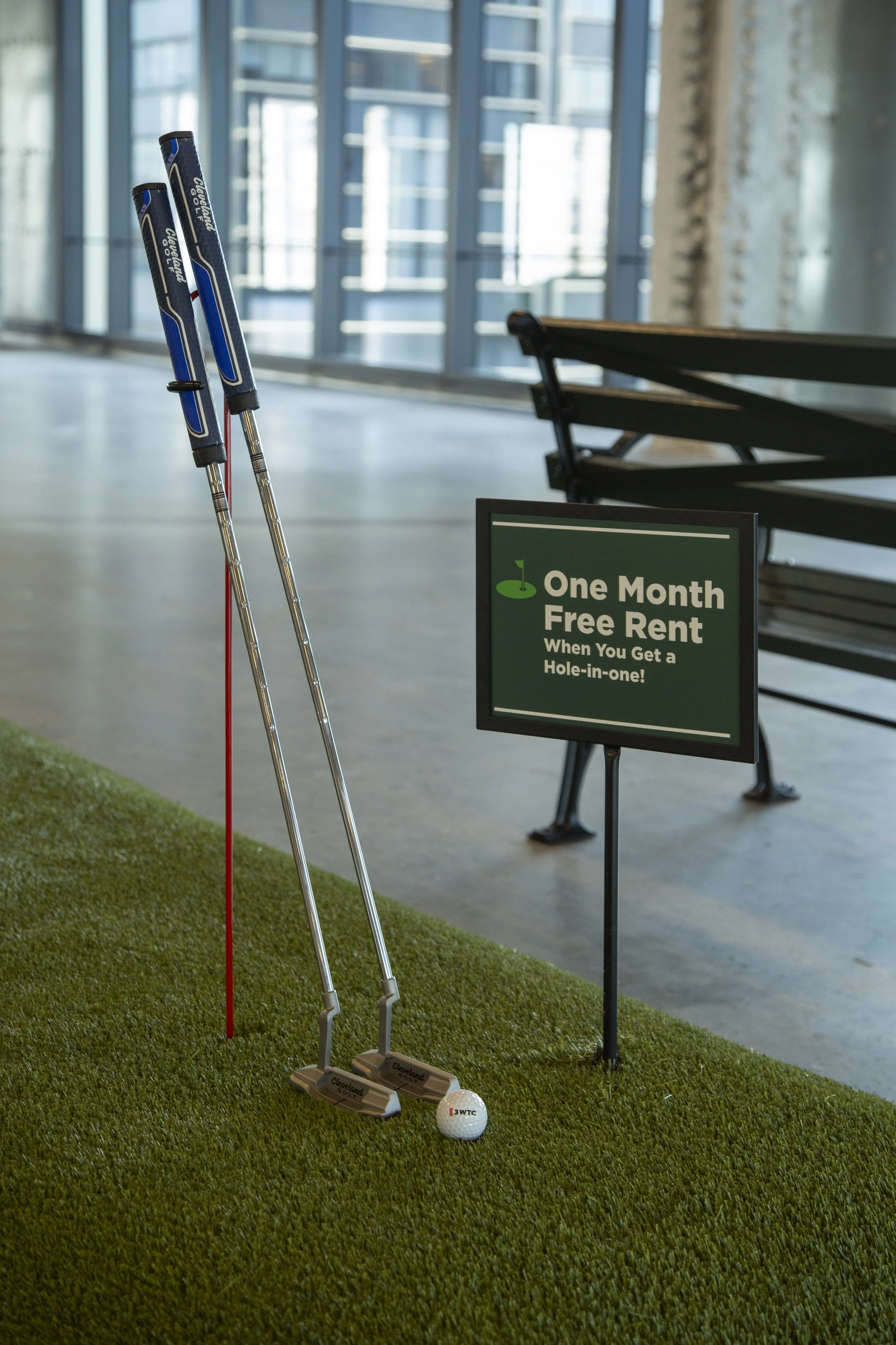
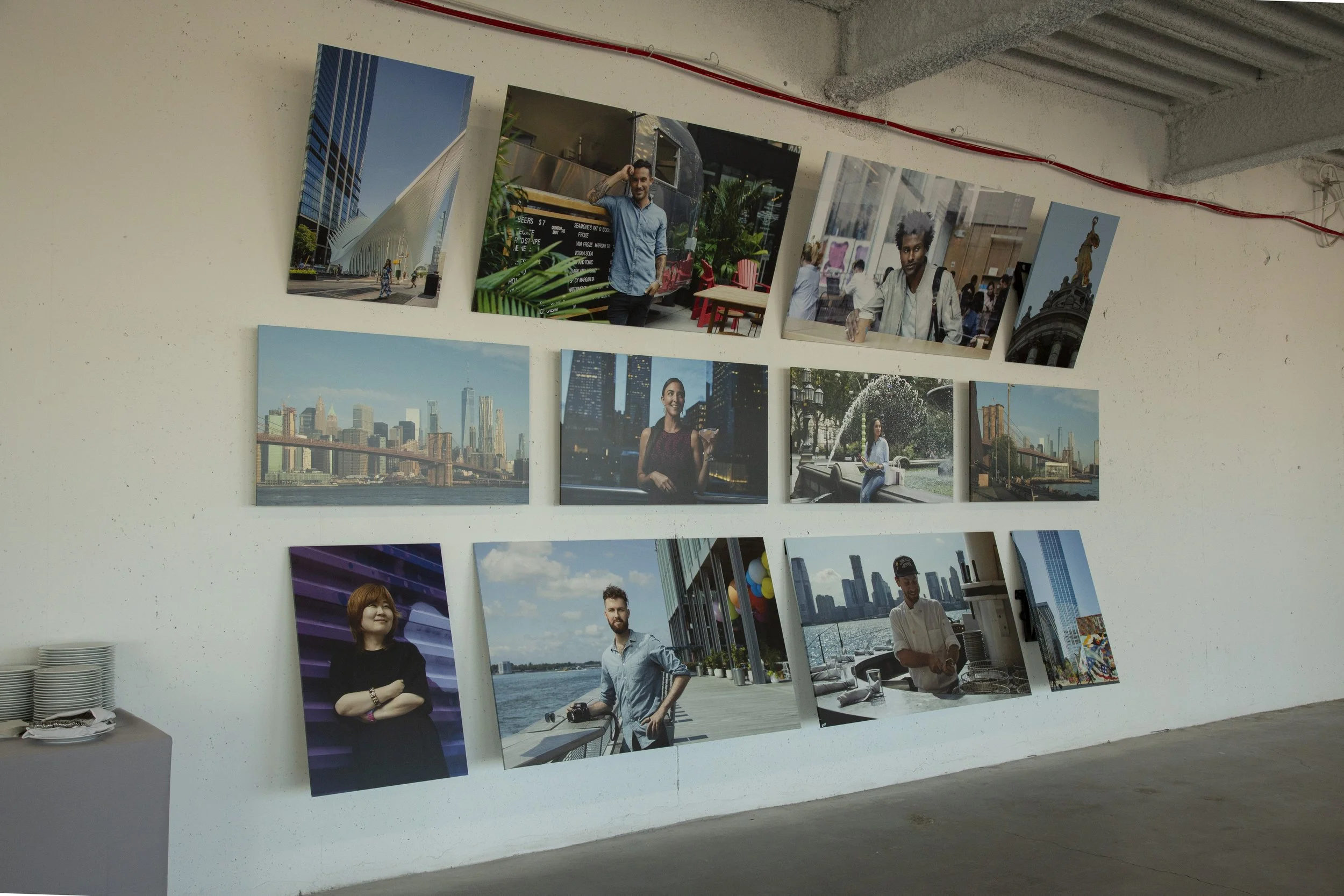
marketing center

